Brand Breakdown: The Seattle Kraken

I think I can speak for most NHL fans when I say I’ve always been drawn to the “Original Six” teams in terms of branding. The Bruins, Rangers, Leafs, Red Wings, Blackhawks, and Canadiens branding feels timeless: simple, classic, and rooted deeply in hockey tradition. Which makes sense because those brands were developed close to, if not, over a century ago.
Then in 2021, the league welcomed its 32nd team, and with it came something entirely different. The branding for the Seattle Kraken was bright, modern, and intentionally juxtaposed to its century-old counterparts. Yet almost immediately, it captured the hearts of not just hockey fans, but brand nerds like me and the new “Krak-Heads” of the Pacific Northwest. The team behind the effort, including Adidas’ creative crew, absolutely went bar-down on this one. (I was going to say “knocked it out of the park,” but I couldn’t resist the hockey analogy.)
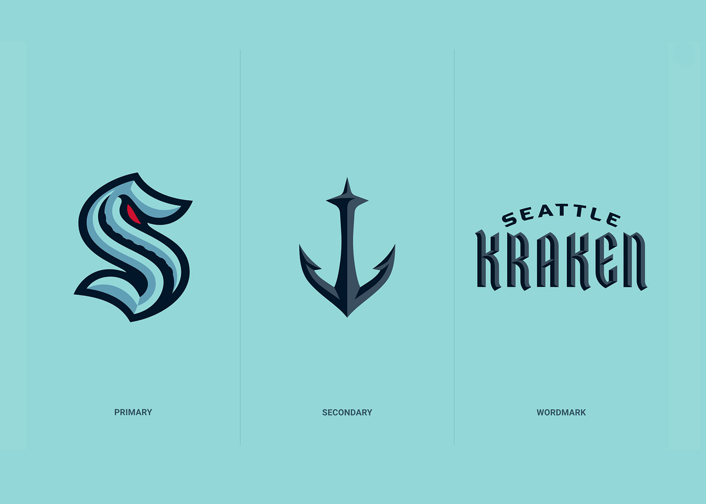
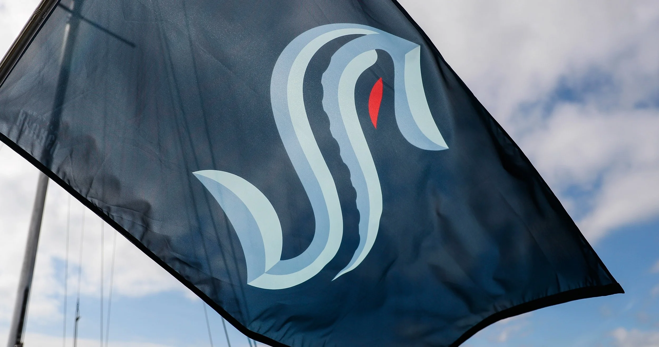
The Kraken’s primary “S” logo is one of the smartest pieces of sports branding in recent memory. At first glance it feels simple. A clean, sculpted letterform with subtle beveling, but everything within it is intentional.
Inside the negative space of the “S,” a curling tentacle is carved into the shadows. It’s not loud or overly literal, which is exactly why it works. It hints at the monster without revealing it, giving the logo a mysterious, almost cinematic mood. It’s a great example of how suggestion can be way more powerful than showing everything outright.

Then there’s the famous red eye. It’s small, sharp, and placed perfectly. A single pop of aggression inside an otherwise cool-toned palette. That tiny detail does so much: it adds personality, creates tension, and gives the whole logo this “something ancient lurking beneath the water” energy. It's memorable in the same way the Red Wings’ wing or the Canadiens’ “C” feels instantly recognizable.

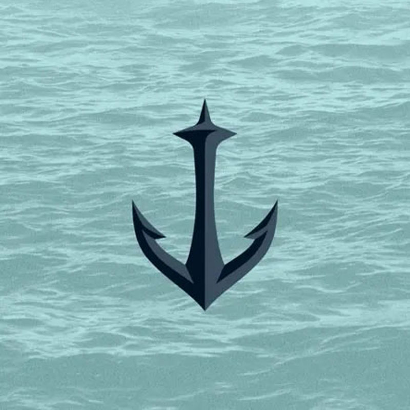
The secondary logo is equally clever. The anchor shape is bold and nautical, but the negative space reveals the Seattle Space Needle right in the center. It’s one of those marks that makes you think, “Of course. Why didn’t anyone do this sooner?” It’s local, symbolic, and designed in a way that even non-hockey fans can appreciate.
When the logo, colors, and patterns come together on the jersey, the identity really shines.
The Kraken didn’t follow the typical NHL formula of dark, neutral, or retro-leaning palettes. Instead, they introduced a completely unique spectrum of icy blues. Four distinct shades ranging from near-black navy to a bright, cold “ice blue.” No other team in the league uses anything close to this color family, which instantly sets Seattle apart on the ice.

The striping on the jersey mimics depth and water layering. Dark at the base with lighter blues rising upward, like the descent into the ocean. When the primary “S” sits dead center, with that glowing red eye locked in, the whole uniform feels cohesive, fresh, and unmistakably Kraken. It's rare for a brand-new team to look this established on day one, but Seattle pulled it off.
The darker alternate jersey (“the deep sea” look) pushes this even further. That subtle gradient from abyssal blue to near-black, plus the glowing accents, makes it feel like a creature rising toward the surface. As a designer, I absolutely love when the uniform itself reinforces the story.
Sports branding walks a fine line: you want something modern enough to feel fresh, but simple enough to stand the test of time. Many expansion teams struggle because they overcomplicate things. Too many colors, too many elements, too much forced personality.
Seattle avoided al
They built an identity that is:
- Clean and iconic enough to sit beside the Original Six
- Modern and atmospheric enough to feel new and exciting
- Rooted in local storytelling without being cheesy
- Flexible for merch, media, and digital use (which is why their gear sold out instantly)
Nothing about the Kraken’s brand feels like a trend. The shapes, colors, and symbolism all feel intentionally crafted for longevity. Something that 50 years from now will still hold up on a jersey or in a hall-of-fame montage.
As someone who lives and breathes both design and hockey, the Kraken identity is one of those rare cases where the execution matches the hype. It’s a brand that could’ve easily gone too literal, too aggressive, or too gimmicky, but instead it’s balanced, thoughtful, and full of smart visual storytelling.
In a league defined by century-old icons, Seattle launched a brand that feels just as timeless, while still bringing something new to the table. Simply put, they nailed it, and set a new standard for what modern sports branding can be.