Red Sox Jersey Design Blunder: A Graphic Designer’s Perspective
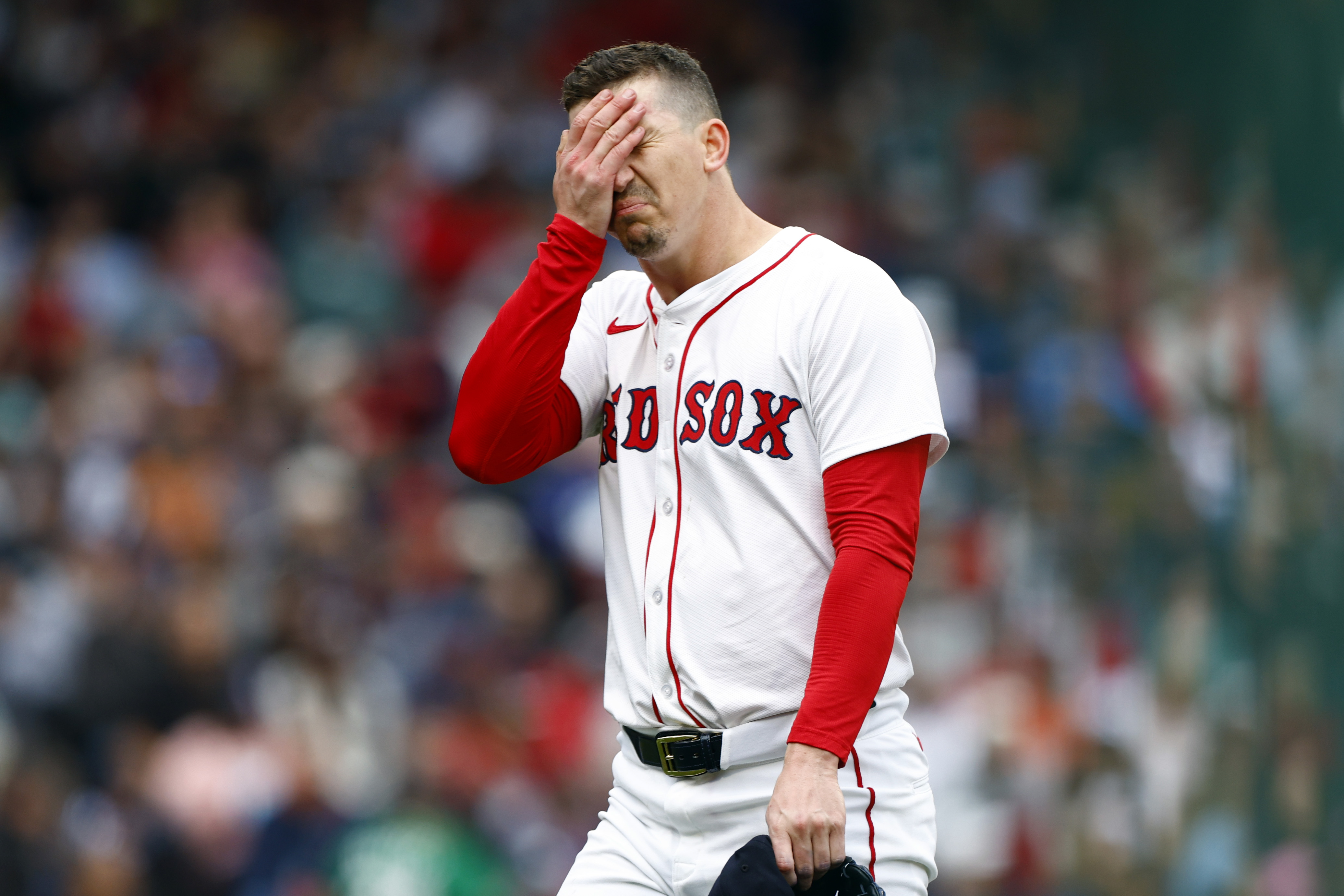
As a designer, there’s nothing quite like going to print and noticing an error in the design. (Don’t lie, you’ve done it too.) Well, stepping out of the on-deck circle and up to bat is the 2026 Boston Red Sox home jersey. On paper, it should have been a simple return to last year’s classic look. In reality? The letters “Red Sox” decided to play a little too close to the piping along the buttons. D and S, in particular, look like they’re auditioning for a contact sport of their own.

This one really left me scratching my head. A professional sports team with a multi-billion-dollar brand, yet something as basic as spacing was overlooked. Attention to detail, folks (and that’s coming from me 😬). This isn’t just a nicety; it’s the difference between a polished design and something that makes fans squint and tweet their frustrations. As designers, we obsess over kerning, alignment, and hierarchy, nudging pixels until they are jusstttt right. Watching this “new” jersey roll out was painful in that weird, migraine-headache kind of way.
Believe it or not, Fanatics is somehow off the hook for this one. They executed exactly what the Red Sox approved. But let’s be honest, the brand hasn’t always had the smoothest track record. From sizing errors to delayed releases, designers and fans have had their fair share of gripes. Still, in this case, the jersey woes fall squarely on the decision-makers who okayed the design before it hit the field.
What this really highlights is that no matter how iconic your brand or how legendary your team you can’t skip the fundamentals. Even a classic, beloved identity like the Red Sox needs a careful eye on the basics. Small spacing errors can feel tiny in isolation, but when they live front and center on a jersey, the entire look suffers. Fans notice, and in the age of social media, they’ll make sure everyone does too.
At the end of the day, this is a reminder for all of us creatives: always check your work, trust your eye, ask for a second opinion, and never underestimate the power of spacing. Because if the Red Sox, a team with decades of tradition, millions of fans, and a design team presumably staffed with experts, can trip over something this obvious, the rest of us mere mortals should probably triple-check our kerning before rounding third and sending it home.