
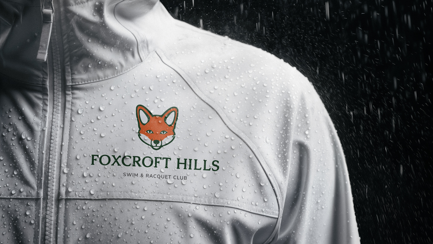
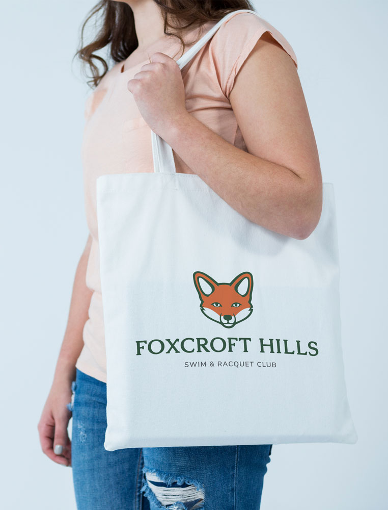
Foxcroft Hills
Foxcroft Hills Swim & Racquet Club had accumulated multiple versions of their logo over time, creating inconsistencies and a brand that felt a bit disconnected. I partnered with the team to refine and unify their identity, starting with the fox mark. Simplifying and reshaping it to feel more modern and clearly recognizable. The typography was also reworked to stay familiar while adding a bit more personality, better reflecting the character of the club and its community. Now, the brand feels cohesive, recognizable, and something the club can confidently stand behind across everything they do.


CHECK OuT SOME
Related Projects

Craig McLaughlin CPA

Twin Thieves Media